1. Having watched the video with Nigel French – describe, in your own words, what each of these colour systems means: RGB and CMYK.
RGB

RGB stands for Red, Green and Blue, and is used on digital surfaces like monitors and digital cameras. RGB is an additive colour, and also the colour of light.The red, blue and green interacts with each other, creating different colours. When the red, blue and green colours interact with each other at the same time and at maximum level, it creates white.
With the RGB-colour mode you can create more colours than in CMYK. For example, a monitor can display millions of colours.
I took a picture of my computer monitor to illustrate how the RGB system works. The image you see is from the colour wheel on Adobe Color. The second picture is from the same colour wheel, only close up and you can easily see the pixels on the screen. As you probably can see, the white is not really white, but is a combination of red, green and blue.


CMYK

CMYK stands for Cyan, Magenta, Yellow and Key (Black) and is used for printing. CMYK is a subtractive colour. When cyan, magenta and yellow interacts with each other, they creat different colours, but in the opposite way as the RGB. For example, when cyan, magenta and yellow is interacting all at the same time at 100% it doesn’t create white like the RGB, but instead it creates a very dark colour (a muddy brown) similar to black. But since the three colours cant create pure black when interacting with each other at 100%, the black (key) is added as a fourth channel.
CMYK can’t create as many colours as the RGB colour mode. For example, you can only get thousands of colours when printing, unlike millions of colours on a monitor in RGB. It is therefore very important to create print work in the CMYK colour mode, so that colours don’t change when being printed.
I took a picture of a newspaper where the cyan, magenta, yellow and black where represented as dots on every page. You have probably seen this on other prints, like magazines, packaging and labels. Sometimes, if you look really closely on a print, you can see small dots creating the whole image and how the colours layered together creates different colours.

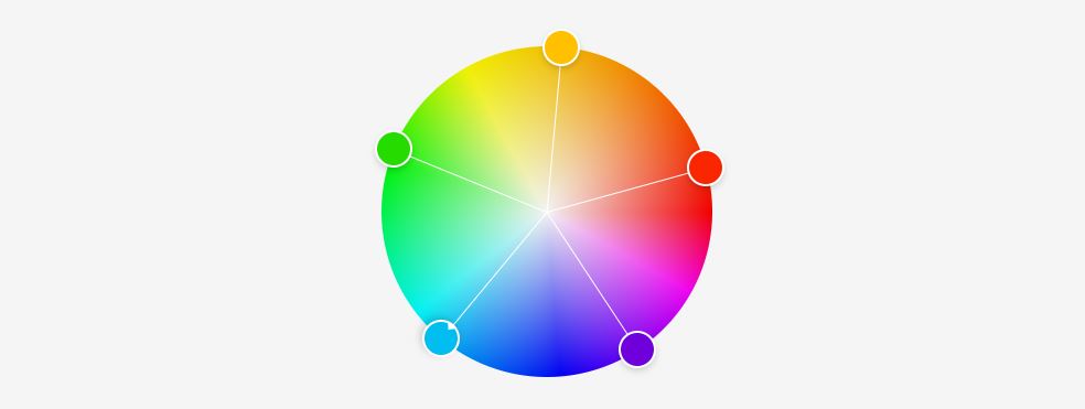
2. Make use of Adobe Colour and develop four different colour schemes. Please hand in screenshots of your schemes:
a. Monochromatic
b. Complementary
c. Triadic
d. Analogous
Monochromatic


Complementary


Triadic


Analogous