4.1 Review and revamp
Makeup Mekka
https://www.makeupmekka.com/no-no/


Tights.no


Skadedyrshop


4.2 Deconstructing taxonomy


4.3 Page inspections
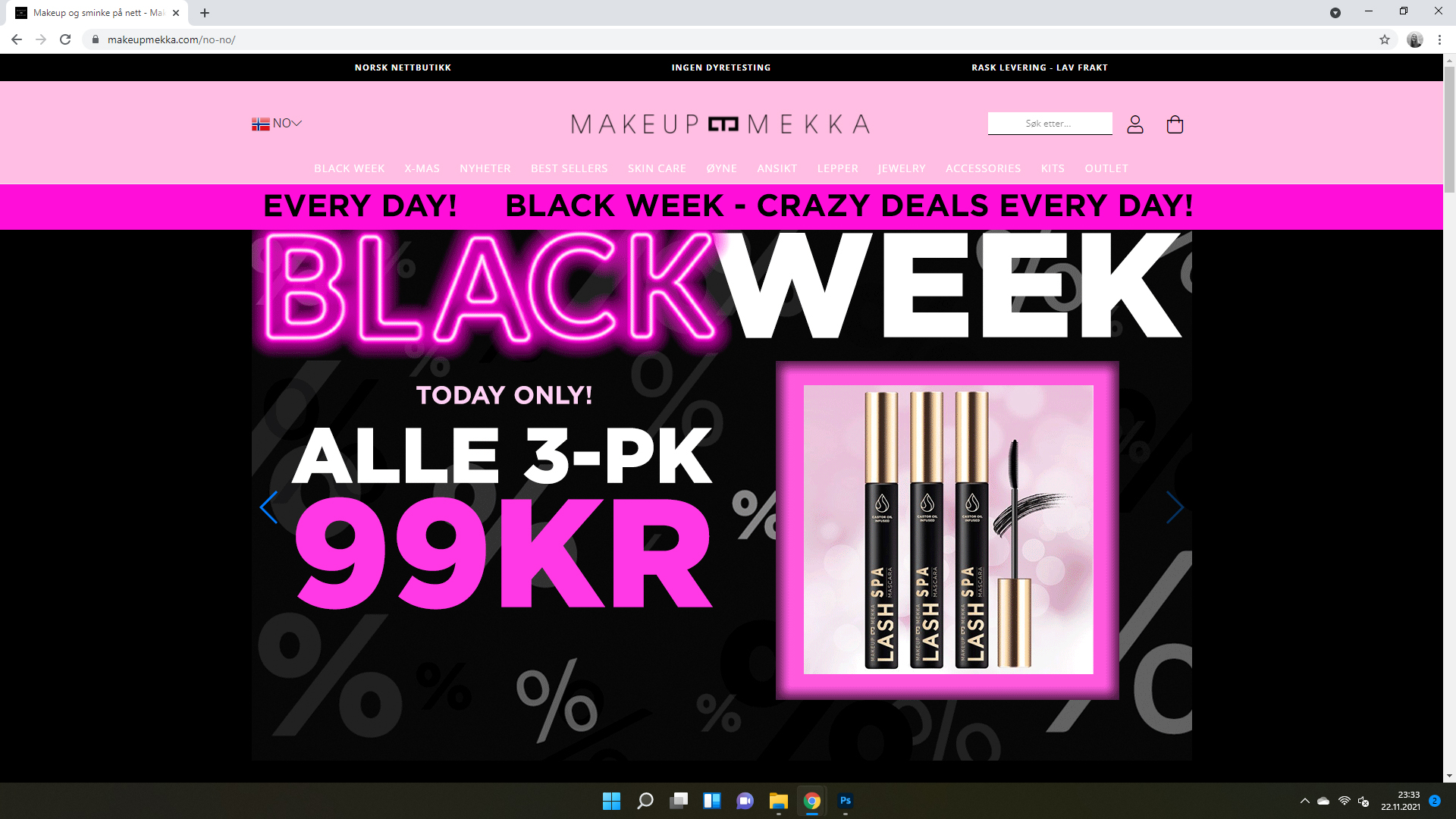
Makeup Mekka
1. Home page

- Updated often
- Easy to navigate
- Huge CTA-area instead of a small button
- Clever use of colors and fonts
2. Category page

- Showing relevant sale products
- Showing most sold products
- Products are shown in a grid view
- Easy to see name of product and price
3. Product page

- Large image of product
- Gallery of detailed images of the product
- Easy to read the text
- Easy to read the price – both the before-price and the sales-price
- Easy to choose color of product
- Big “add-to-cart”-button
- More suggestions similar to the chosen product
- Further details and testimonials down the page
4. Cart

- Immediately after pressing “add to cart”, an overview in the top right corner pops up with the total price of the products in the cart and delivery
- Easy to delete products from cart without leaving the page that you’re currently on
- Easy to add more of the products in the cart
5. Checkout

- Nice and clear view of the products in the cart
- Large text, making it easy to read
- Easy to add a discount code
- The price is presented clearly
- Easy to add “last minute” products to the cart, suggested by the website down below
- Neat and organized in general
4.4 Getting technical