Surf the web and find 10 sites you would consider to be great websites. Simultaneously, make a list of 10 sites you consider bad web sites. Remember to describe why you would define them as such. Upload your lists on your blog.
Great websites
1. This is a portfolio of a Product Designer located in New York. I like the simplicity, color use and the fact that the product is displayed right away.
2. User friendly and easy to navigate
3. Has got the most important feature on the middle of the page, which is when the next train leaves and a button where you can buy tickets.
4. A very inspiring and innovative website
5. Very elegant, neat and pleasant design
6. I really like the scrolling sideways, and the fact that the images turn from b&w to color when you hold the mouse over.
7. A clean and neat website with the product in focus.
8. Clear and precise page
https://www.audi.no/no/web/no.html
9. Simple and pleasant design that communicates what the company offers.
https://www.norskemikrohus.no/
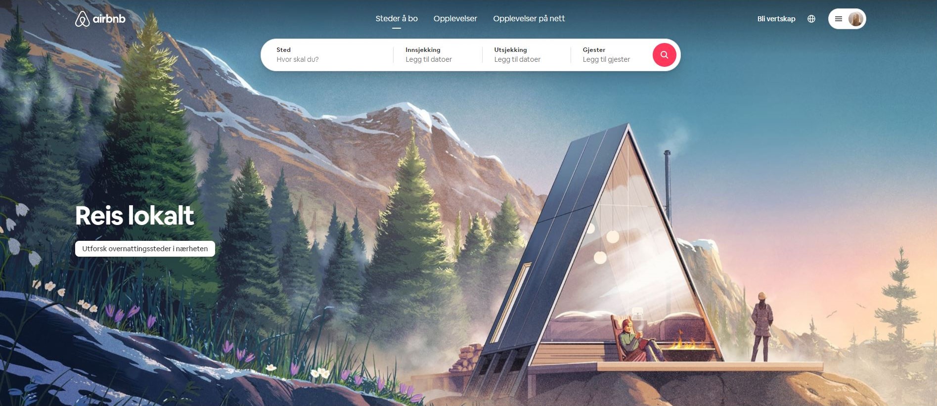
10. I like how they have the whole page covered by an image of a modern Norwegian cabin, but the style of the illustration is vintage. In case this page will be updated or the image changed, I have posted a print screen underneath.

Bad websites
1. Although I use this website from time to time, I think that it is not the most user friendly website. It is also very messy because of all of the ads all over the page.
https://www.thesimsresource.com/
2. It looks like this page hasn’t been updated since the early 2000s.
3. There is so much text and so little variation on this website, that it is hard to navigate through it.
https://forum.kvinneguiden.no/
4. A website that I think should really update in terms of design is Wikipedia. It is such a big encyclopedia that is used all over the world, yet it still looks like it’s from the early ages of the internet.
5. What a mess… Way too much content and ads. It is hard to separate the articles from the ads.
6. Too much information and text on one page. There is too little contrast between the font and the background, so it makes it hard to read. The fonts used on the page seem very random, and there are way too many of them.
7. A little too much text on the page
http://www.allekonkurranser.no/
8. Very outdated…
https://www.norskenettsider.no/
9. Also very outdated…
10. Too many ads and outdated look