In this assignment, you will be given the opportunity to also test your idea sketching skills. It is important to start working with basic ideas on paper and develop your concept from there on out.
- On an A4 landscape page, draw four equal squares. Create 4 more pages in this way. So, you’ll have 5 pages with four squares on each.
- Draw one or two squares or rectangles in each empty square to achieve the visual effects that you see on the first page of module 3 in Graphic Design School textbook. You can work with the interaction of rectangles and squares to make the balance or imbalance more evident.
- Entering left
- Movement to the right
- Movement to the left
- Movement downwards
- Movement upwards
- Balance
- Tension
- Symmetry/asymmetry
Produce at least two different versions of each effect, recording your results each time. Explain in one or two sentences what you wanted to achieve (as shown in your manual).
- Submit your drawings and findings at WordPress.
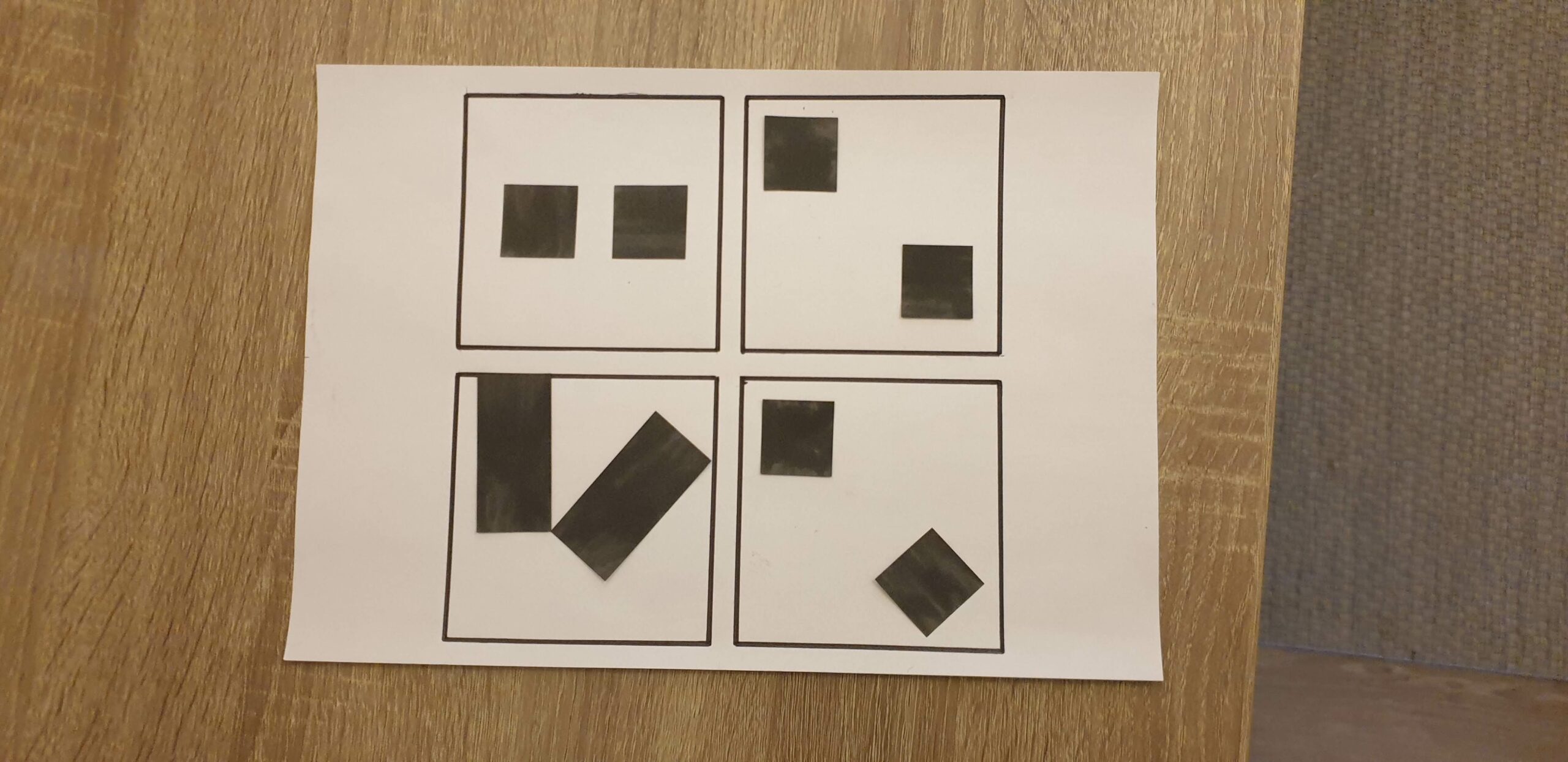
On the top: Entering left
Here I wanted it to look like the squares are entering from the left, starting with one square placed into the line (the first frame) and then another square approaching (the second frame).
On the bottom: Movement to the right
Here the shapes are placed on the right side of the frames. I wanted to keep it tidy and balanced instead of having the shapes rotated in random positions.

On the top: Movement to the left
Like the movement to the right, I wanted to keep the shapes tidy and balanced, but at the same time tilt them 45 degrees creating diamonds.
On the bottom: Movement downwards
I wanted a strong and grounded look for the one on the bottom left, so I went for a rectangle. On the one to the right, I went for the opposite.

On the top: Movement upwards
The two squares are placed with the same gap between the two squares, and the top square and frame line. The squares to the right are placed close to each other in diamond shapes simulating speed. They also point like an arrow.
On the bottom: Balance
To the left I wanted a strong look and made to rectangles with equal gaps between the to shapes and the frame line. To the right I wanted a simpler look and placed a tilted square in the middle of the frame.

On the top: tension
The tension one was a little bit harder to understand. I went for a more messy look, but in an organized way. The shapes are heavier and placed in an asymmetrical way, but I still made sure that the lines in the different shapes aligned with each other.
On the bottom left: symmetry
When I first made this, I imagined a symmetry line going vertical in the middle, but now I also see that the symmetry line can be horizontal, crossing the two shapes in the middle.
On the bottom right: asymmetry
This is almost the same arrangement as in the frame that is symmetrical, only that one square is tilted and the other one is not. I think it is interesting how the tilted square to the right seems bigger than the square to the left.

On the top: symmetry
To the left I did the same as in the previous symmetrical frame, only tilting the squares back so that they are parallel to the frame. To the right I arranged the squares diagonally in their own corner of the frame. At first I was a little bit unsure if this is symmetrical, but if you draw a line diagonally from one corner of the frame to the other, it is symmetrical.
On the bottom: asymmetry
Here I wanted it to seem like the shapes are falling down. The one to the right is just like frame number two on this sheet, only that the bottom square is tilted. This creates more movement to the frame I think.