Compare the design (in terms of pace and contrast) of an online magazine, blog or website to that of a printed magazine, book or journal.
1. What differences can you see between the kinds of design strategies used in the two formats?
2. Write down your findings and upload it to WordPress.

I chose to look further into Ikea and the differences between their website and their catalog. One important similarity between the catalog and the website is that Ikea use the same font and thickness of the font. Like for example the price of a product. The price is in big, bold letters both in the catalog and on the website. Another similarity that I spotted is the colour use of the font. It is mostly in black or white on both platforms, but, when there is a new product it is marked with “nyhet” in a dark orange colour. The same goes for products marked with a lower price, only that the colour is red. You can see this example on the website (the image above) and in the catalog (the image under).

Limitations on paper vs. opportunities online

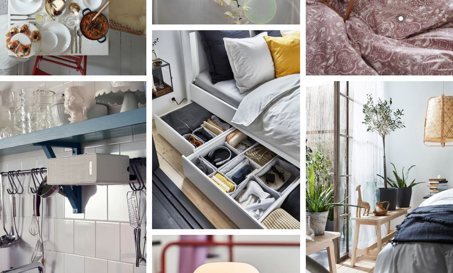
On these two pages from the catalog you can see how the arrangement of the images leads the eyes from the left to the right. The red colour make the products stand more out, and the attention is immediately drawn to the different usage of the products. The images has got text on them, but it is only the most necessary information that is put there: a number, the product name, what kind of product it is and the price. For more information about the product there is a numbered list where you can get more information about the material, sizes and more. I think they have done it this way so that the images are not filled with a lot of unnecessary text, taking away the attention of the product itself. Online it is different, because it is easier to make different interactions on the images since it is digital.

Ikea display their products different in the catalog and on their website. In the catalog, like I wrote about above, they put the most important information right beside the product. They also have arrows pointing on certain products, with a following text to show examples of usage as well as explaining the product like seen on this image.
Online they do a similar thing, but instead of having lots of text all over the images, they have created different interactions, like white dots where the brief information about the products pop up whenever you hold your mouse pointer over the dot. If you click on the dot, Ikea takes you directly to the page of the product, making it easier to chose different colours, read more about the product, and of course ordering the product. This can be seen in this video: