1. Take a magazine, newspaper or book that includes images and text. Lay tracing paper over the top of three spreads (both left-hand and right-hand pages). Using a pencil and ruler, carefully trace the grid underlying the page layouts. Remember to remove specific text elements or images, and to only draw the grid lines. Note column widths and margin sizes at the top, bottom, and to the left and right of the main body of text. Is your document based on a two-column, three-column, or another type of grid? Which elements stay the same on each page, and which change?
2. Publish your findings to your WordPress blog and provide photos or scans of your exercise.

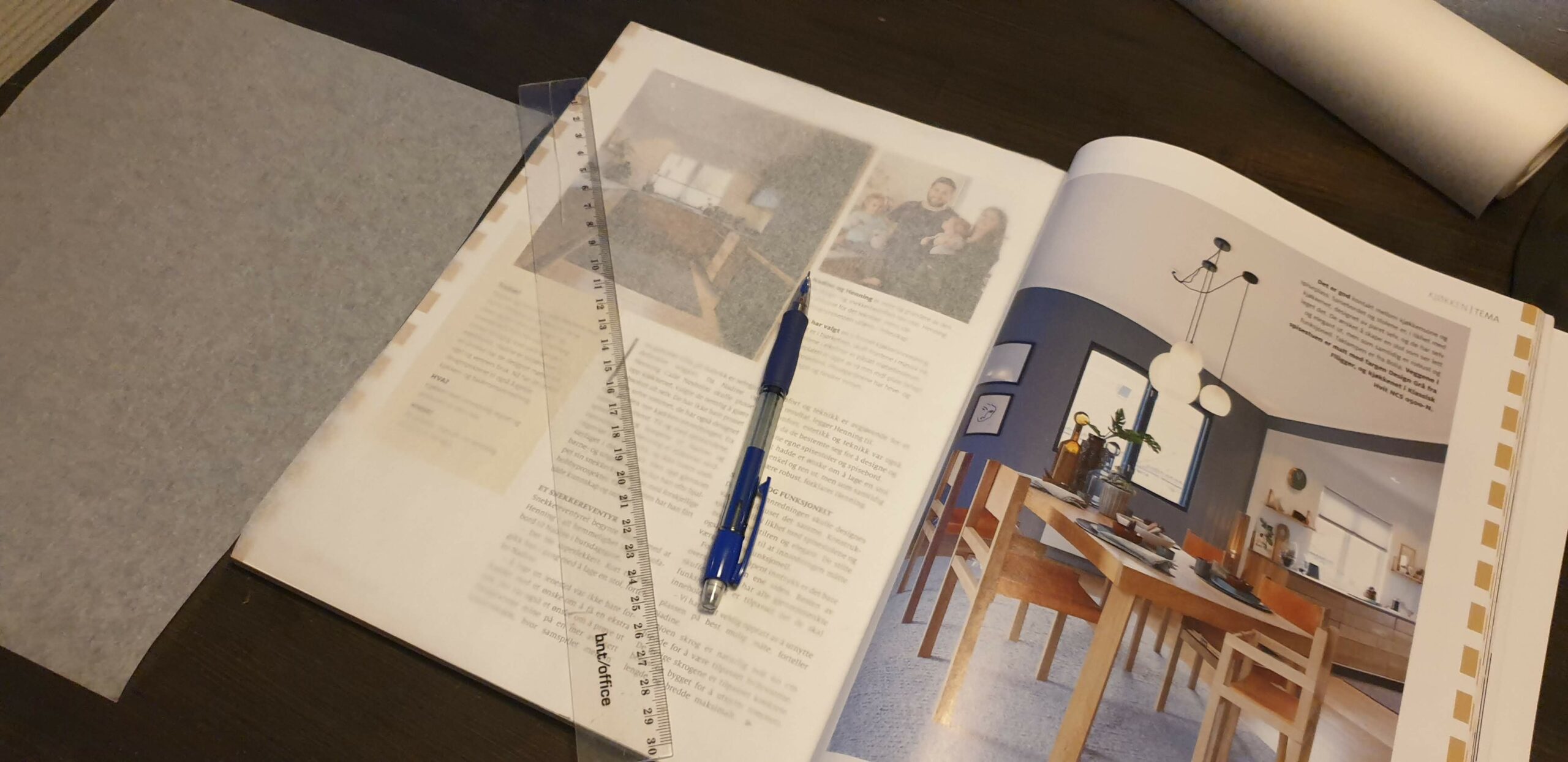
I used an interior magazine that has a lot of text and images. This magazine has got a lot of interesting lay outs, but is at the same time very neat and organized. To trace the grid lines I used baking paper, a ruler and a pencil.


These pages had a lot of different sections, but was still well organized I think. The page to the left is based on a three-column grid and the different columns are separated by lines going between them. They have the same gap between them (5 mm). On the right page the text is in a two-column grid, but at the same time there is an image to the right making it seem like it could have been a three-column grid. But, the image is placed too far up and to the right for it to be a clean three-column grid. The two circles on top of each page make the pages connected, and you understand that the two pages are related to each other.


I think it is interesting how they fill a whole page with one image (the page to the left), and at the same time they use the blank space in the image where the text fits perfectly. As you can see, the distance between the text box and the edge of the page is exactly the same on the top and the left. On the right page they played a little bit more around with the shapes. I like how the top image just continues outside the edge of the page. This makes the two pages connect with each other.


I like these two pages because they have a clear margin highlighted on each long side of the pages edges. The margins are only 6 mm wide, but still managed to make the whole article connected. The margins on the side also points out that this is a themed section of the magazine, as they continue for some more pages.